by Open Door Media Team | Feb 25, 2018 | Blog, Websites
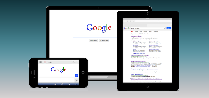
Mobile websites are becoming more important than ever. Google has begun to research and ranking mobile friendly websites higher than those that are not. However, it is still unknown how they are looking all the variations of “mobile” websites. Here are the...

by Open Door Media Team | Feb 18, 2018 | Blog, SEO, Websites
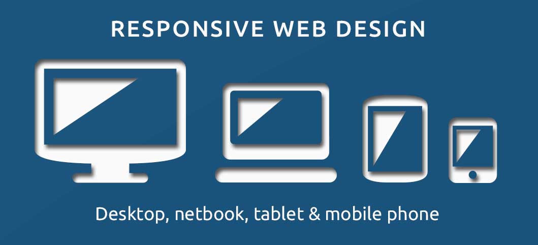
General descriptions are: Responsive web design – changes to the size of the screen no matter what the target device screen size is. The layout is ‘fluid’ and harnesses the power of CSS media to change styles. This fluid grid lets the page resize its width,...

by Open Door Media Team | Feb 11, 2018 | Blog, SEO, Websites
If you are reading this, it is probably because you keep hearing the term “responsive” and are not sure what it is and if you need it. Short answers are yes you do and Google search results is the main reason why. Secondary short answer is that people on...

by Open Door Media Team | Feb 4, 2018 | Blog, Websites
What is an adaptive website? Kind of like it sounds, an adaptive website will adapt to the display size of the visitor. This means it will create a different page for different types of devices. Currently, adaptive web pages are set at resolutions 320, 480, 760, 960,...
