What is an adaptive website?
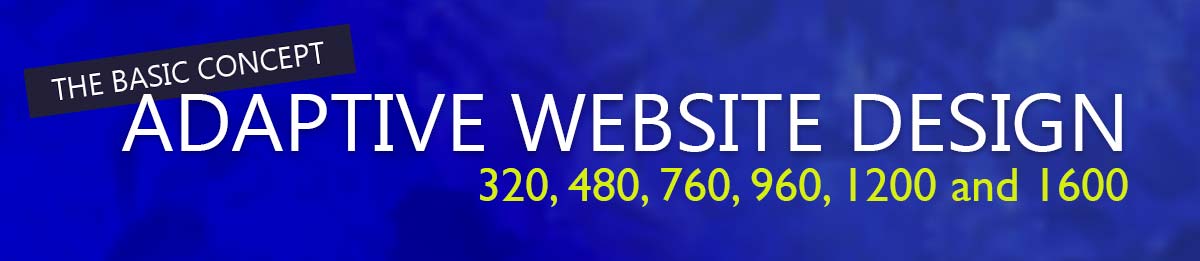
Kind of like it sounds, an adaptive website will adapt to the display size of the visitor. This means it will create a different page for different types of devices. Currently, adaptive web pages are set at resolutions 320, 480, 760, 960, 1200 and 1600.
This does not mean that it will change if you move your phone from portrait to landscape or edit the resolution of the display on your laptop. You can do these things, but you would need to refresh the page for the website page to “adapt” to your screen change.
Adaptive websites can allow for more finite crafting of your content, with less effort by the browser, but it can also lead to more design work and more changes with device changes. Meaning, if the new iPhone comes out and the resolution points are different and you want to have a version for the new mobile device, you will need to create a new version of that page.
AWD is a great thing for those who want the greatest control of the visual presentation of their content. Just keep an eye out for possible ranking pitfalls from Google or other search engines. You may also find greater development cost as less companies offer this design type.